
Art Docent Program
Everett Public Schools
Art Vocabulary: The Art Elements
The Art Elements are the basic visual building blocks of any artwork.
LINE: A mark left in the path of a moving point.
Horizontal, Vertical and Diagonal
Types: Dotted, zigzag, thick, thin, wavy, curvy, etc.
In drawing:
Contour lines, hatching and cross-hatching, gestural lines
In composition:
Horizon Line- A horizontal line indicates where the sky and the land meet at the edge of the horizon in a landscape.
Ground line- A horizontal line that indicates the plane an object is sitting on, such as a table or other flat surface.
SHAPE: A closed space made when a line turns to meet itself.
Geometric Shape: The shape’s area can be determined by mathematical formula, such as squares, rectangles, circles, etc.
Organic Shape: A shape with curvy sides and an irregular shape.
Freeform Shape: A shape that combines organic and geometric elements.
FORM: A shape that is, or appears to be, three-dimensional; having height, width and depth.
Geometric Form: A form's area can be determined by mathematical formula, such as sphere, cone, cube, etc.
Organic Forms: A form that is irregular and curvy in configuration.
VALUE: The lightness or darkness of a surface. ‘Lights and Darks’
Contrast and Gradation
In color: Lights and darks.
Related vocabulary in drawing: Highlights, middle values, core shadows, and cast shadows.
Light Source Highlight
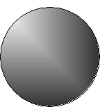

Middle Values
Cast Shadow

Core shadow

Art Elements, Continued
SPACE: The area around, above, below and within an artwork. ‘Near and Far’
Positive space/negative space- Refers to the visual relationship between the space occupied by subject matter in an artwork (positive space) and the unoccupied space that surrounds it (negative space).
To depict three-dimensional space on a two-dimensional picture plane, artists use a number of devices. Such devices used are Linear Perspective, including Foreground/Middle Ground/Background, Overlap, Relative size, Placement in the picture plane (high/low), details/ lack of details. The use of color includes bright/dark (to make things appear closer) vs. dull/light (to indicate they are farther away).
TEXTURE: A surface that can be seen or felt.
Actual- A texture that can be seen and felt.
Simulated- An illusionary texture that can be seen but not felt.
COLOR: The visible spectrum of reflected light, which is classified by a colors hue, value and intensity.
Hue: Refers to color families
Primary Colors: Red (Magenta), Blue (Cyan or Turquoise) & Yellow
Secondary Colors: Made by mixing two primaries to make Orange, Green and Violet
Tertiary/ Intermediate Colors: A combination of a primary and secondary color, such as yellow-green.
Value: Refers to the lightness or darkness of a color.
Adding black to a color makes ‘shades or dark values’ of a color. Adding white makes ‘tints, or light values’ of a color. Mixing both black and white to a color results in a ‘tone’.
Intensity: Refers to the brightness or dullness of a color.
Color intensity is dulled by mixing a color with it’s complement (the color across from it on the color wheel).
Complementary Colors: Colors that are across from each other on the color wheel. Complementary pairs are Red/Green, Blue/Orange and Yellow/Violet. Mixing complements together make neutral colors, like browns and grays.
Warm colors- Warm colors are colors like fire: Red, orange and yellow.
Cool colors- Cool colors are colors like ice or the forests: Blue, green and violet.
Back to top